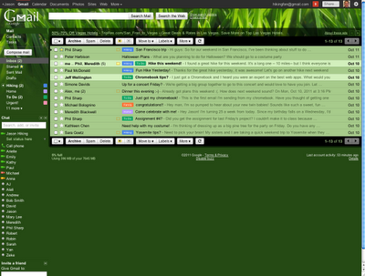
Themes are now implemented as semitransparent layers on top of a large background image. Each theme uses either a dark or light variant of most UI elements to balance legibility and visibility of the background image, allowing the background image to peek through and provide color and personality. Background imagery can also change based on date, time, or weather. Bringing all these changes together really makes the new themes shine:
 |  |
 |  |
In addition, these changes also reduce the technical complexity of the theme system, which will enable us to create more beautiful and unique themes in the future.
Like the new themes? You can switch to the new look today by clicking on Switch to the new look in the bottom-right of Gmail.
No comments:
Post a Comment