Tuesday, December 20, 2011

Scribbles for Gmail for mobile - a creative way to email

From prehistoric humans etching in caves to the modern-day thinker sketching a stroke of genius on a napkin, scribbling is a natural form of human expression. Not constrained by formatting or font styles, scribbling is a versatile outlet for expressing individuality and creativity. Not to mention it's a lot of fun.

Now you can quickly convey that eureka moment to a colleague, or simply brighten a loved one's day with a personal scribble in Gmail for the mobile web browser and the Gmail app for iOS. In the compose view, click on the scribble button to open up the drawing window. A lightweight interface makes it easy to get your idea down.

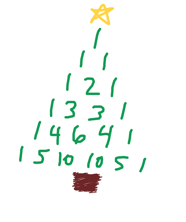
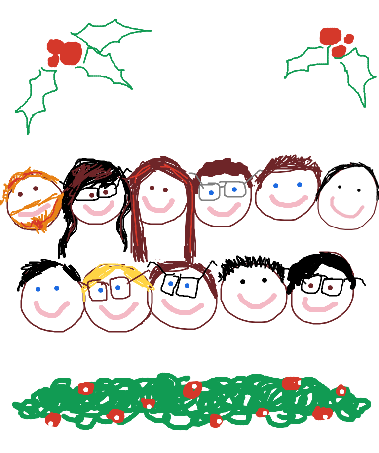
Need a bit of inspiration to get started? With the holidays just around the corner, it's a great time to send a handmade, festive greeting:


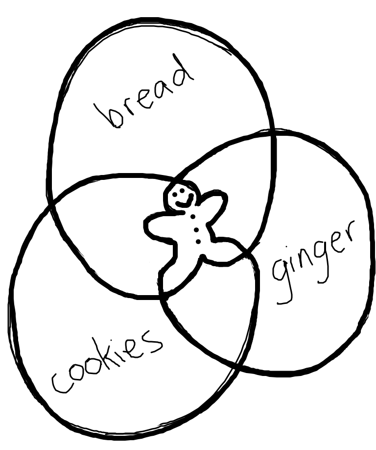
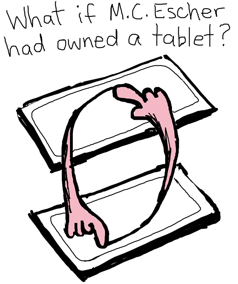
Or, perhaps your wit is better-expressed pictorially than textually. Use scribbles to send original comics to your friends, or generate a new meme:


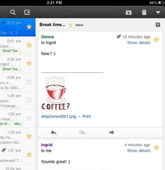
Simple requests are that much more appealing from someone who puts in a bit of effort:


It’s also great for simply emoting beyond the limitations of plain text:


At the end of the day, it's a blank canvas. What do you want to share? To get started, head to mail.google.com on your iOS 4+, Android 3.1+ or Playbook device, or download the Gmail app for iOS from the App Store today.

We want to see what you can do! Send your scribbles to gmailscribbles@google.com and then share them with the world using #GmailScribbles.*

Brought to you by the Gmail team. Happy Holidays!


*By emailing your scribble to gmailscribbles@google.com, you give us your permission to upload, share or reproduce your scribble both digitally and physically. Unfortunately, we will not be able to showcase all submitted scribbles, and will have to pick and choose amongst the ones that we receive. Remember: have fun and be cool about it - nothing offensive and nothing that violates the law. Thanks!

Saturday, December 17, 2011

Ho-ho-hold the phone: Santa’s on the line

Last year, Santa got his very own Google Voice number, and people around the U.S. received a special personalized holiday phone call from Santa Claus.

This year, Santa wants you to reach out to him (after all, reindeer are only so-so conversationalists). If you or your family members have a special request for Santa, you can call him right from Gmail* and leave him a message at his Google Voice number: 855-34-SANTA. Santa won't be able to return messages himself—it’s a busy time of year for him—but he's promised to keep us up to date on happenings in the North Pole day by day.

You also can create and send a unique, customized phone call from Santa to anyone you know, from your nieces and nephews to old college friends, over the phone (to U.S. numbers only). Listen to a sample phone call, and send a message of your own from SendaCallFromSanta.com.

Of course, Santa is never one to fall behind the technological times (word on the street is that Rudolph’s nose was recently upgraded to an energy-efficient LED). So while the red suit may never go out of style, this year Santa has come up with an extra special way to spread the holiday cheer. But you’ll have to wait until it’s closer to Christmas to find out what it is. So no peeking—but keep checking the site!

Happy Holidays from your friends at Gmail.

*Calls from Gmail are free for U.S. and Canadian users, but will cost people outside those areas $.01/minute (plus any applicable VATs).

Friday, December 16, 2011

Updates to the Gmail app for iOS

When we launched the Gmail app for iPhone, iPad and iPod touch, we said we were just getting started and would continue to release updates regularly. Today we updated the app with some new features and interface improvements.

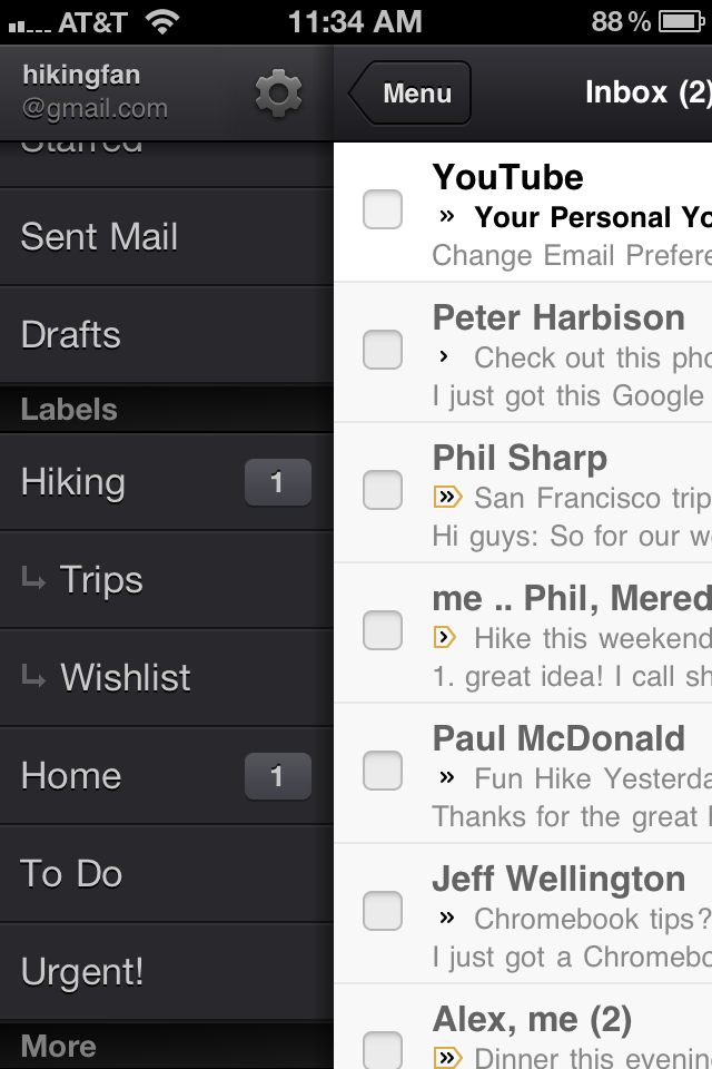
We've added the ability to set a custom signature for your mobile messages and a vacation responder, both available through the gear icon at the top of the menu view. We've also improved labels with support for nested labels:


Additionally, if you are using iOS 5, we've changed the notification sound so that it’s easier to distinguish when you've received an email.

We’ve also got another fun feature to make your language even more colorful (in a good way!). In the Gmail app and Gmail for mobile you can now open up a canvas and scribble a message that will be attached to your email. It's perfect for sending a quick sketch that is hard to express in words or adding a fun graphic to make your email more personal.

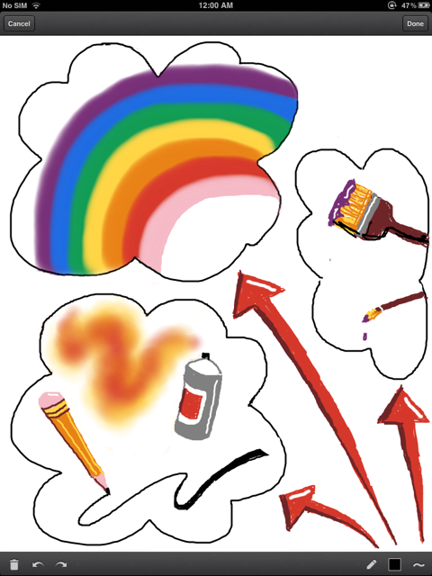
Scribbles support different colors, brush sizes, lines, erasers and spray paint. This example was created in the Gmail app on an iPad:


Behind the scenes, we're continuing to work on highly requested features like banner notifications, multiple login support and the ability to send-as from any account already configured in Gmail. We want to make sure these are done right as we continue to improve the Gmail app.

Wednesday, December 14, 2011

Free calling within the US and Canada through 2012

As the holiday season approaches, we're happy to announce that we've extended free domestic calls within the US and Canada for 2012.

This is our way of helping you connect with friends and family across the country. And you can still call the rest of the world from Gmail at our insanely low rates.

Friday, December 9, 2011

Gmail and Contacts get better with Google+

We want to bring you a great experience across all Google products which, for Gmail and Contacts, means understanding what you care about and delivering it instantly. With that in mind, we’re introducing some new integrations with Google+ that we think will make Gmail and Contacts even better. If you use Google+, you can now grow your circles, filter emails and contacts by circles, keep all your contact information up-to-date automatically and share photos to Google+, all right from Gmail and Contacts.

Grow your circles from your email
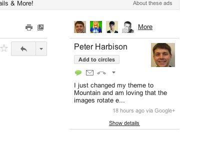
Now when you open an email from someone on Google+, you can see the most recent post they’ve shared with you on the right-hand side of the conversation. If they’re not in your circles yet, it’s easy to add them straight from Gmail.


Find information from the people you care about most
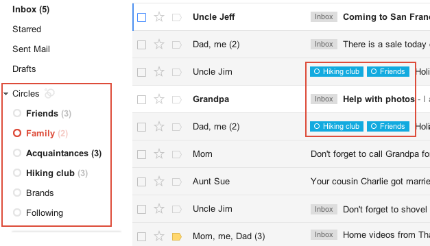
Looking for the info on an upcoming family holiday gathering but can't remember who sent it? If you've spent time building your Google+ circles, you can now quickly use them to filter your mail, saving yourself from having to sift through that pile of daily deal emails and newsletters. You can see messages from all of your circles at once or from each individual circle. And if you want, you can show circle names on emails in your inbox. Contacts can also be filtered by circles, making it easier to view your social connections.


Keep your contact information up-to-date automatically
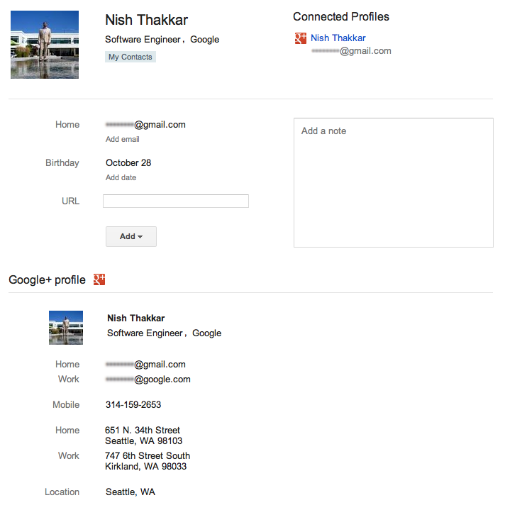
Manually entering contact information can be a huge time drain—so let your circles do it for you. If your contacts have a Google profile, their contact entry in Gmail will be updated with the profile information they’ve shared with you, including phone numbers, email addresses and more. If they change it in the future, you’ll get those updates automatically. You can also make sure the people you care about have your most up-to-date contact information by updating your own Google profile and sharing it.


Share effortlessly without leaving your inbox
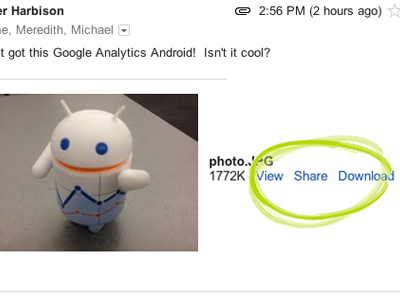
Lots of great images are sent through email, but sharing those photos with friends on Google+ used to require downloading the image from Gmail and re-uploading to your profile. Not anymore: Now you can share photo attachments with one quick click. The image(s) will be uploaded to your Google+ photos and be viewable only to the circles that you choose to share with.


We’ll be rolling out all of these changes out over the next few days to Gmail, Gmail Contacts and the “standalone” version of Google Contacts at contacts.google.com. Please note that Google Apps users won’t see the Contacts updates quite yet, but we’re actively working to make them available.

All of these features (and the more to come) are the result of the great discussion that we had on Google+ with users in July. If you want to join in discussions like these, add the Gmail Google+ page to your circles. And if you haven't signed up for Google+ and would like to try these new features, visit this page to get started.

Thursday, December 8, 2011

Testing Gmail’s new look

Editor's note: This post, like yesterday's, is more technical than most posts here, but we thought some of you might find it interesting to look inside how Gmail works.

Yesterday, we talked about how we make changes like the new look to Gmail. The new look is not just visual, but involves completely different code in the interface. Testing a large user interface (UI) change like we launched for Gmail is foremost a permutation problem. Because all the Gmail features we wrote while we developed the new UI had to work both there and in the old existing UI, we basically needed to double our testing. Plus, the new UI has to work in many browsers, in all languages Gmail is available in, which means even more testing -- and by testing, we mean functional testing, latency testing, usability testing... you get the idea! The only way to handle all of these moving parts is through a) test automation, and b) using the new look.

We use automated tests as much as possible: we test if code changes lead to functional regressions, how they affect speed and our servers, if the UI breaks in many browsers and more. The scalable build and test infrastructure at Google allows us to run these tests automatically after every single(!) code change. However, a major UI change like this requires that our automated tests are very stable. If a test relies too much on the structure of the UI, then the test starts failing - not because the functionality is broken, but because it fails to work with the new UI. Luckily, we learned this lesson many years back and most of our tests did not have this problem.

But even the best automated tests can’t guarantee that everything is working well and that the visuals are pleasing. The only way to find out is to actually use the new look. For Gmail, we have special environment that gets updated every night with the latest stable code. Almost all Gmail engineers and a handful of other Googlers are using this environment for their real Gmail usage. But it turned out even daily updates were too slow for the rate of code change with the new look. So, we created an environment that updates every hour with the latest stable code. This version of Gmail was used by all engineers who worked on the redesign. It allowed us to test code changes very quickly on the real system. We were able to find many functional and usability issues here. And because we used this system and no engineer likes their email to be broken, issues were fixed very quickly. We can only do this because we have a very good coverage by our automated tests. When all these tests pass, we can be sure that most of the Gmail functionality is working. However, there could still be usability, color, layout or other challenges that tests can't catch.

Gmail’s new look also put a lot of additional load on our testing team. They had to keep up with a high rate of change, test critical functionality quickly and triage a lot of reported issues. Plus, they had to test new features in both the old publicly-available UI as well as the new unlaunched UI. The dedication of our testing team helped us catch bugs early so we could fix them in preparation for launch.

Once we felt that the new look was good enough to be used by others, we turned it on for all Googlers. At Google, we "eat our own dogfood," meaning we use new products and features ourselves before releasing them to the public. Often, this is a very humbling experience. The shiny, new features, that we just developed and are so proud of are now used by people, including sales teams, managers and other non-engineers, who just want to get their job done. And believe me, Googlers are not shy when it comes to feedback! But for a project like this one, this step is absolutely critical. Our different teams at Google tested Gmail in all kinds of use cases and the feedback that we received from this phase was invaluable. It helped us to put the final touches on the new look and get ready for usability tests that were previously discussed.

We hope you've enjoyed a look into the Gmail's design, development and testing of the new look.

Wednesday, December 7, 2011

Developing Gmail’s new look

Editor's note: This post is more technical than most posts here, but we thought some of you might find it interesting to look inside how development on the Gmail team works.

Developing the new look for Gmail was like the proverbial “changing tires on a moving car” - only that the car is carrying hundreds of millions of users and is under constant construction and development. The two main technologies that we use for these types of projects in Gmail are “conditional features” and “Javascript mods” (other Google products use very similar systems). Both technologies were particularly important for testing the new look.

Let’s start with the first one: conditional features. This is our ability to make changes to the Gmail code that get deployed, but not executed. You can think of it as a lot of if-statements around the new code that get enabled when the conditional feature is on. The conditional feature flag itself is set outside of the deployed code. These flags can be set in various ways: as a percentage of overall users (if we want to rollout a feature slowly), for Googlers only (if we want to use a new feature internally), for individuals (if we want to give users early access to a features) and in many other ways. In short, conditional features allow us to update our production systems separately from releasing new features. This way, Gmail developers can make changes, but don’t have to worry about their unfinished changes being released before they are ready.

The other technology is “Javascript mods”. We use this technology to create modifications for a new feature in Javascript across many files. The main challenge with Javascript is that we want to keep the amount of Javascript code that the browser has to download as small as possible - the more code the browser has to download, the longer it takes to load Gmail. So, we don’t want to include the code from all possible mods, but only the code that’s relevant to your browser. Let’s use our Gmail mobile app as an example: it comes in various forms, including the smartphone user interface (UI), the tablet UI, and the offline UI. All these UIs are slightly different. We don’t want to download the Javascript code for all different UIs to the browser. Instead, our server inspects which browser or device you are using and creates the exact Javascript that you need. The selection of mods can be triggered by browsers, devices and even “conditional features”.

Using these technologies, we can make sweeping changes in Gmail without those changes going “live” before they are ready. Plus, since we can turn pieces of code on or off, we can enable new features in specific environments, such as Google, or for specific users, like the Gmail team, without changing the code itself.

Tuesday, December 6, 2011

Designing Gmail’s new left navigation

One of our goals for Gmail's new look was to make Gmail feel more like a native application with independently scrolling panels rather than a website that scrolls as a single page. This design approach brings with it many advantages: the search box and primary navigation are always in the same place, your inbox unread count is always visible, etc. As with any design decision there were challenges with making this change. People with lots of labels might have their chat contacts pushed entirely off the screen and those with gadgets, like the Google Docs or Calendar gadgets, might have to scroll the left panel past both the labels and the chat contacts in order to see them.

We went through a number of different design revisions to try and address these issues as elegantly as possible. We experimented with several accordion designs, which stack sections on top of each other but only allow one or two to be open at a time.


We also experimented with designs that involved only one scrolling region, but showed fewer entries per section.


The final design combines aspects of both approaches. It is a ducking accordion design with only two sections. The bottom section has two tabs, one for chat and one for gadgets, with room to add more tabs in the future. The upper section, which contains labels, expands to show all of the visible labels when you mouse over it. This allows you to see chat contacts but still give quick access to the labels. Best of all, you can easily adjust the balance between labels and chat to fit your own personal preference by dragging the divider between the sections up and down.


This design went through a number of iterations as well. We carefully adjusted the timing and triggering behavior of the expanding labels section to minimize accidental triggering. We noticed in usability testing that having the labels section expand when you are mousing over the Inbox label delete didn't work for everyone. We tweaked the system only to expand if you moved your mouse below the inbox label and keep it there for a moment. We also tried to ensure that if you are moving your mouse to click on a particular label or chat contact, that label or chat contact will never move out from under you.

The end result is a system that is more flexible, more responsive, and always keeps your chat contacts and unread count visible without adding a lot of complexity or requiring too much clicking around.